Appearance & themes
Settings → General → Appearance controls how Aletheia looks and feels. It's the first place to make the app yours.
Themes
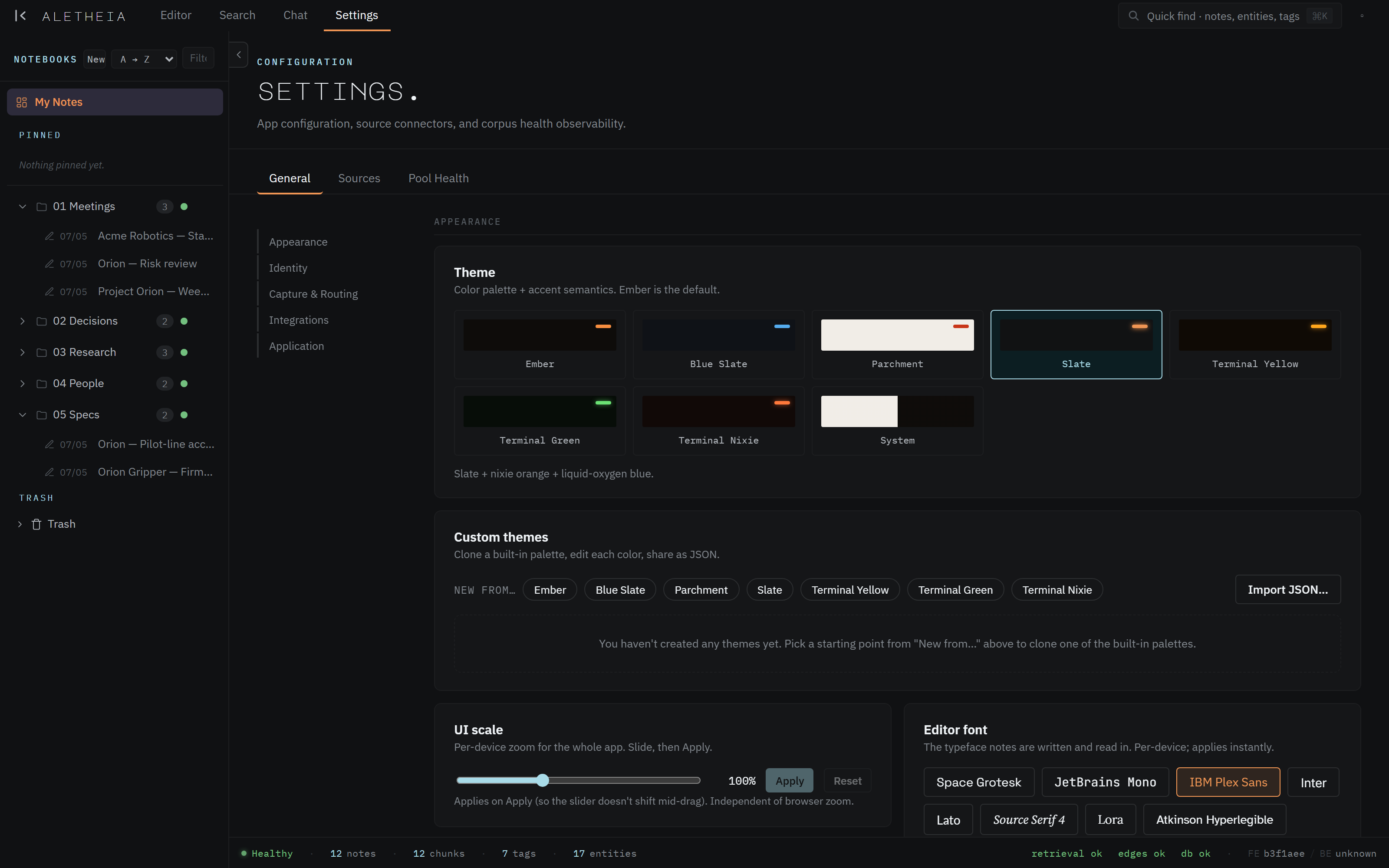
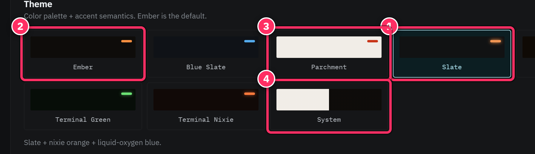
Pick a color palette + accent from the built-in set:
- Ember (default) — warm dark.
- Blue Slate — cool dark with a blue accent.
- Parchment — a light, paper-like theme.
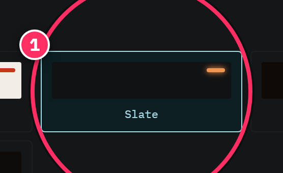
- Slate — cool neutral dark with nixie-orange accents and liquid-oxygen blue for data (the theme every screenshot in this manual uses).
- Terminal Yellow / Green / Nixie — high-contrast, retro-terminal palettes.
- System — follow your OS light/dark preference.
Click a swatch to apply instantly; your choice persists on this device.
Custom themes
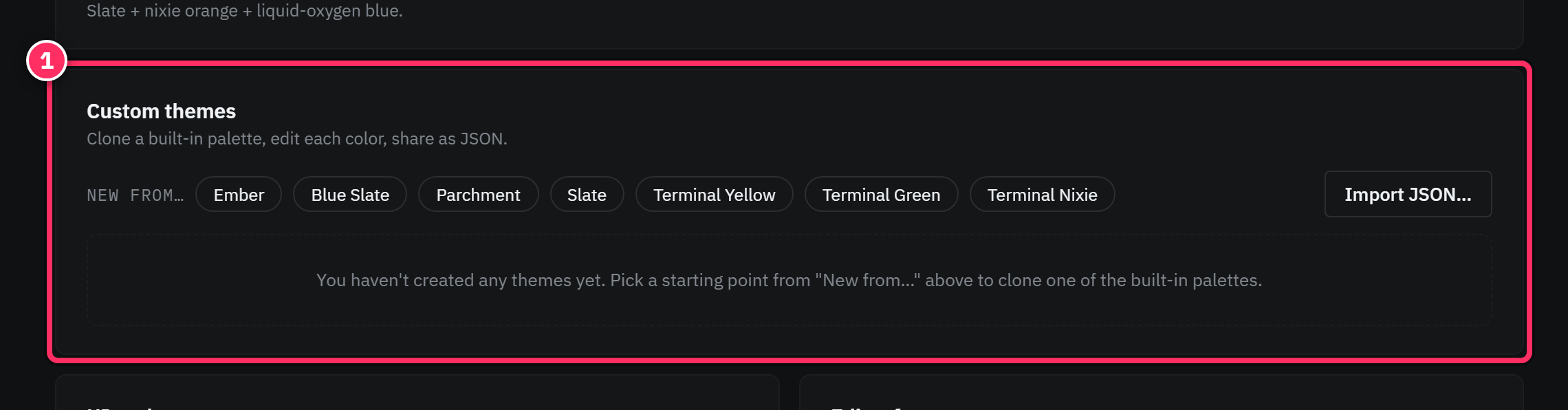
Not quite happy with a built-in? Clone one as a starting point (New from…), then edit each color to taste. You can export a theme as JSON to share it, or Import JSON to bring one in. Good for matching a brand palette or dialing in contrast for your display.
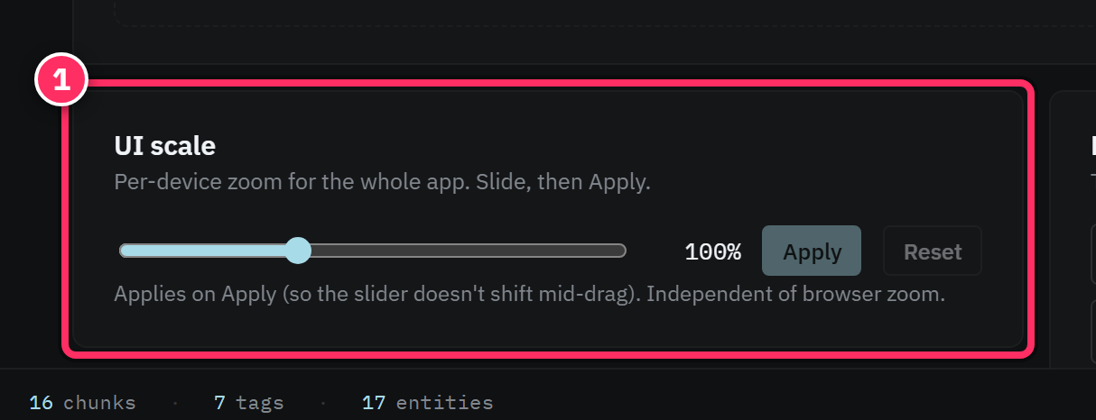
UI scale
A per-device zoom for the whole app — slide, then Apply. It scales spacing and type together, independent of your browser's zoom. Useful on very high- or low-DPI displays, or to fit more on screen.
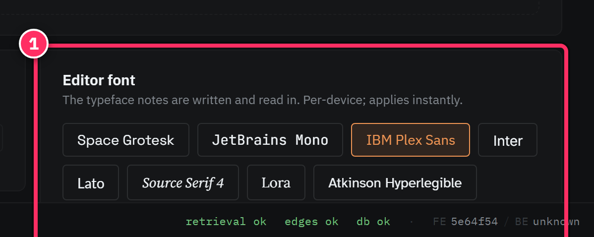
Editor font
Choose the typeface your notes are written and read in: Space Grotesk, JetBrains Mono, IBM Plex Sans, Inter, Lato, Source Serif 4, Lora, or Atkinson Hyperlegible (a legibility-optimized face). Per-device, applied instantly — pick whatever you find most comfortable to read for long stretches.
Match the theme to the room
The dark themes (Slate, Ember, Terminal) suit focused, low-light work; Parchment is easier on the eyes in a bright room or for long reading sessions. System flips automatically if you already switch your OS between day and night.
Next: Identity & autorouter →